
Sunday, 20 October 2013
Thumbnail 88 Colour Composition
This thumbnail is a colour rendition of the thumbnail 79. The composition is balanced and i make use of depth but I think it has an element of being too overloaded with colour and/or detail, losing the impact I try to achieve.


Thumbnails 86 & 87
These two thumbnails are two separate looks at how this single composition can be done with slight tweaks to both. The first looks and using perspective lines to construct the scene as accurately as possible while using previously explored building design for the foreground buildings.
The second design uses a different method where I roughly drew out what I wanted the city to look like in a large black brush and then defined each building and the skyline using the rubber, with the negative space as my line work and showing depth with the grey tones in the background. The high contrast works well I think and gives the composition a totally different feeling.
 |
| 86 |
The second design uses a different method where I roughly drew out what I wanted the city to look like in a large black brush and then defined each building and the skyline using the rubber, with the negative space as my line work and showing depth with the grey tones in the background. The high contrast works well I think and gives the composition a totally different feeling.
 |
| 87 |
Thumbnail 85
Attempting to combine several ideas together on this one, but found that I overloaded the canvas instead. As well as losing the impact of the corner building by hiding the top and bottom points the rest of the composition reads terribly and looks untidy and forced.


Thumbnail 84
This thumbnail was a back to basic idea for my cityscape, although a step backwards from previous developments it allowed me re-draw a starting line for future designs.


Thumbnail 83 Colour Composition

Thumbnail 82 with Colour Composition
This thumbnail is an attempt at combining 55 & 56's traits into a single image. I've used slightly more curved lines for the buildings and used another thumbnail idea for the background. I think it works well, but not well enough for my final ideas. The colour composition for this piece brings the scene to life more, with the blue and orange/yellow being a complementary colour scheme. I was attempting to show how a city's energy is inside its buildings at night, with the buildings different shades of blue and the windows a bright orange to show energy.


Post-Greenlight Thumbnails 54 - 81
 |
| 53 & 54 |
 |
| 55 |
 |
| 56 |
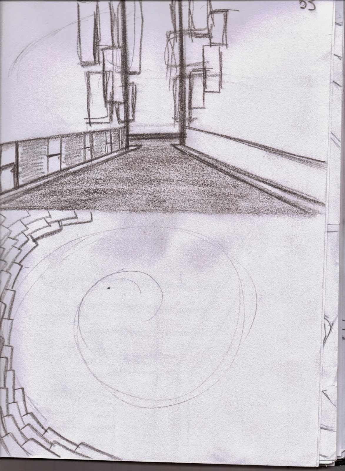
Thumbnails 55 & 56 where two defining ideas within the cityscapes development as each lent a different feeling to the space. I feel 56 really brought the space to life with its disorderly and distorted buildings and jumped feet first into expressionism, where as 55 remained orderly and too structured, removing all emotion from the foreground and middle ground and conflicting with the mismatched background.

 |
| 57 |
 |
| 58 |
 |
| 59 |
 |
| 60 |
 |
| 61 |
 |
| 62 |
 |
| 63 |
 |
| 64 |
 |
| Top Left: 65 Middle Left: 66 Bottom Middle: 67 |
 |
| 68 |

 |
| 81 |
Subscribe to:
Posts (Atom)